Bella Academy
Case Study
Bella Academy is a boutique style ballet school based out of Bombay, India; that teaches classical ballet. Bella Academy’s core values are sincerity, passion and commitment through which they aim to motivate and inspire their students helping them to develop their confidence.
The objective of the project was to establish a brand language that can be used seamlessly across print and digital platforms. As well as using the established language to design assets for social media, events and branding collateral.
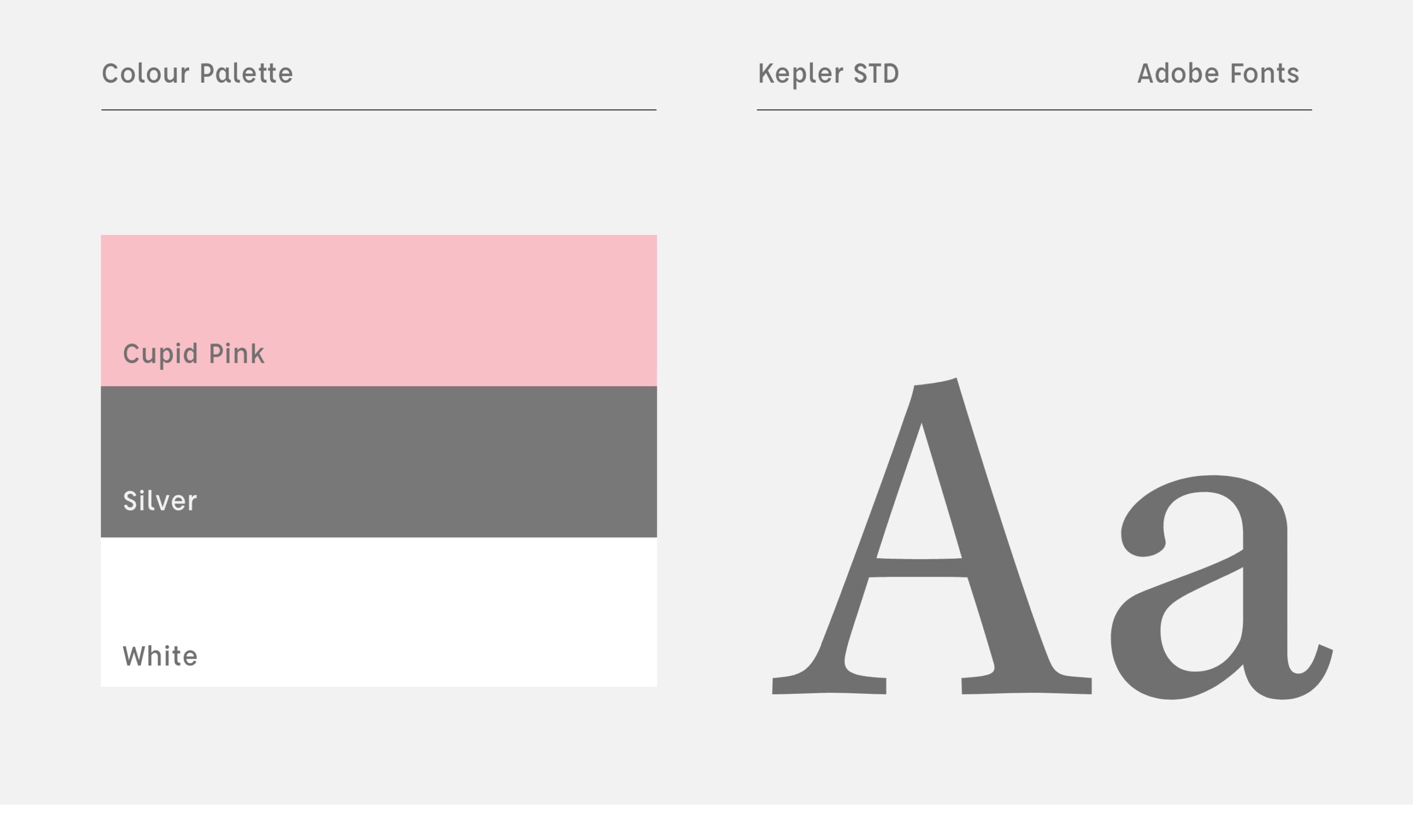
Brand Language
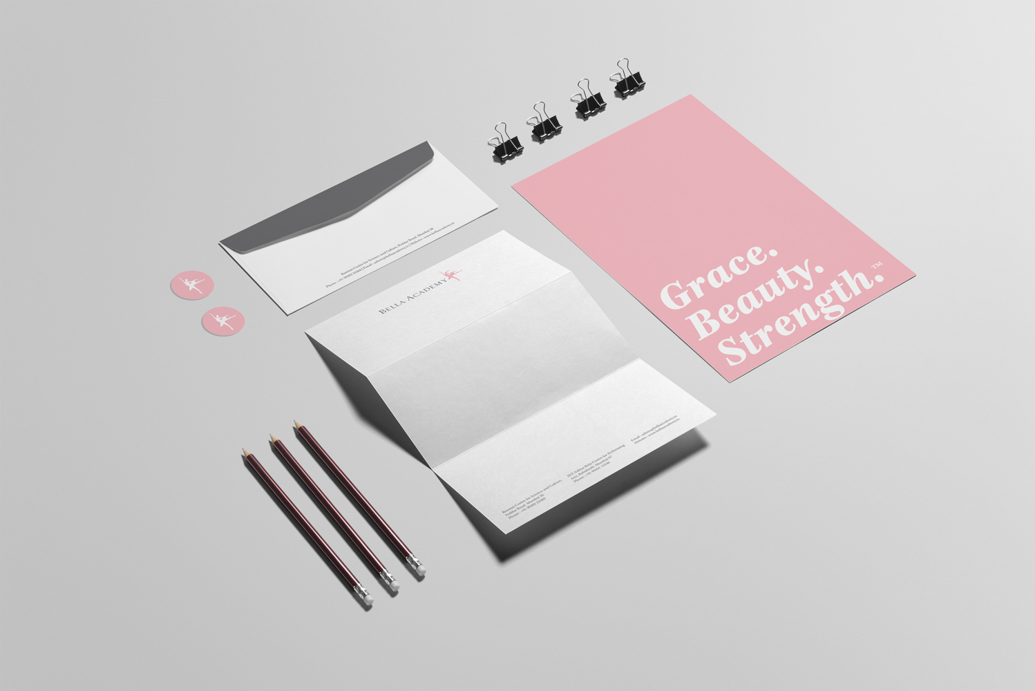
The brands colour palette reflects its tagline ‘Grace, Beauty & Strength’. Cupid Pink denotes Beauty, White denotes Grace and Silver denotes Strength.
The primary typeface for the brand is Kepler Std with a strong form and delicate serifs the typeface reflects the brands personality.
Additional Logos
To celebrate Bella Academy’s 10 year anniversary we designed a graphic to symbolise their dedication towards ballet, teaching and their students.
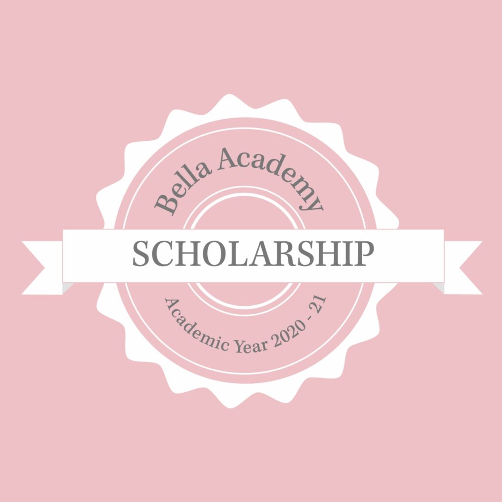
We also designed a logo for their scholarship programme and their productions.

Brand Identity
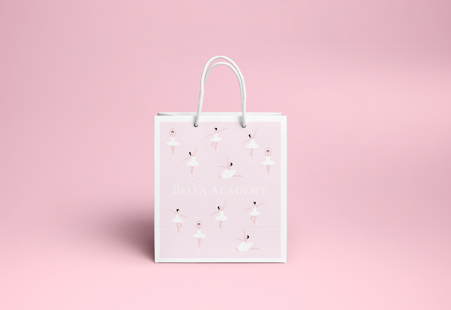
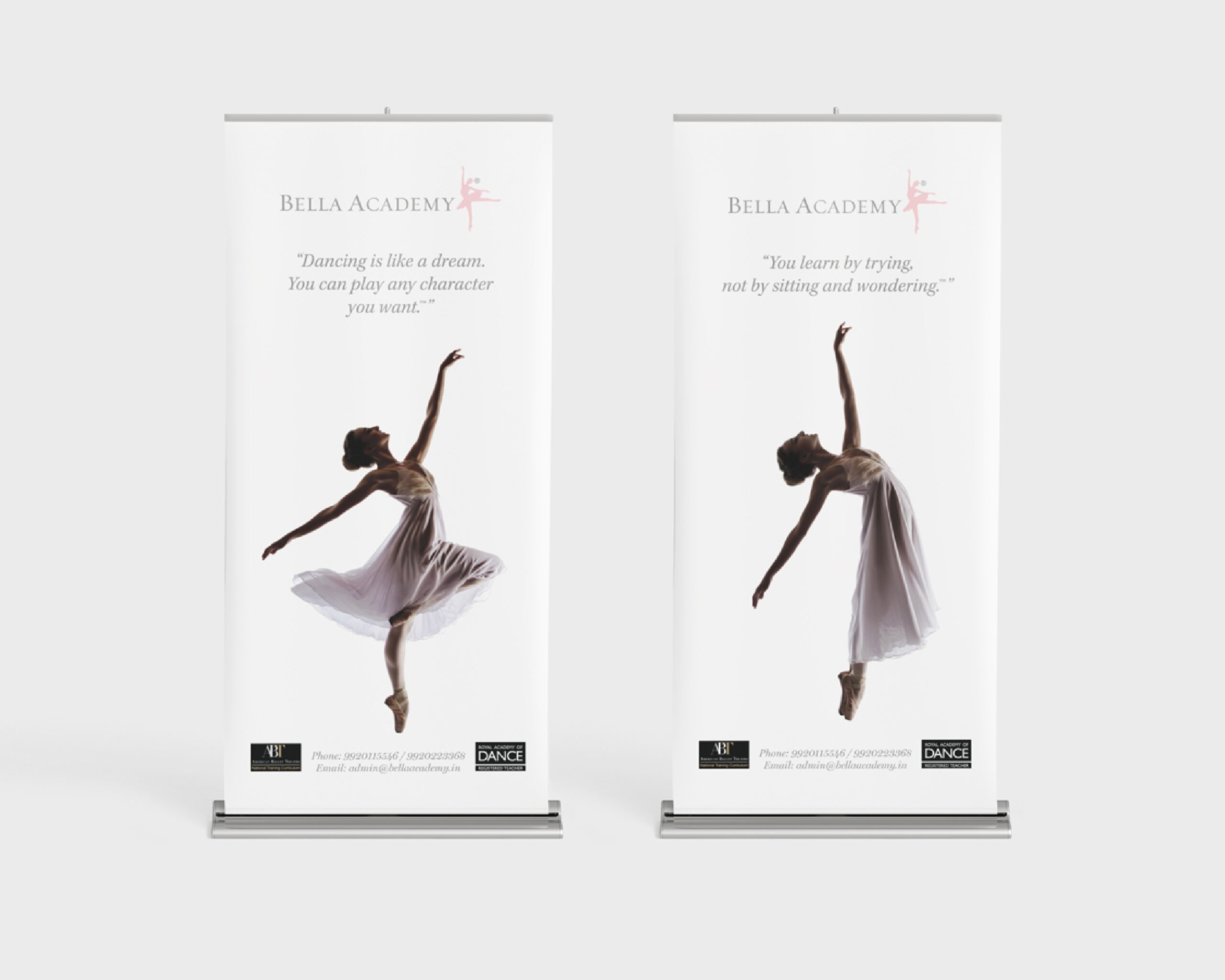
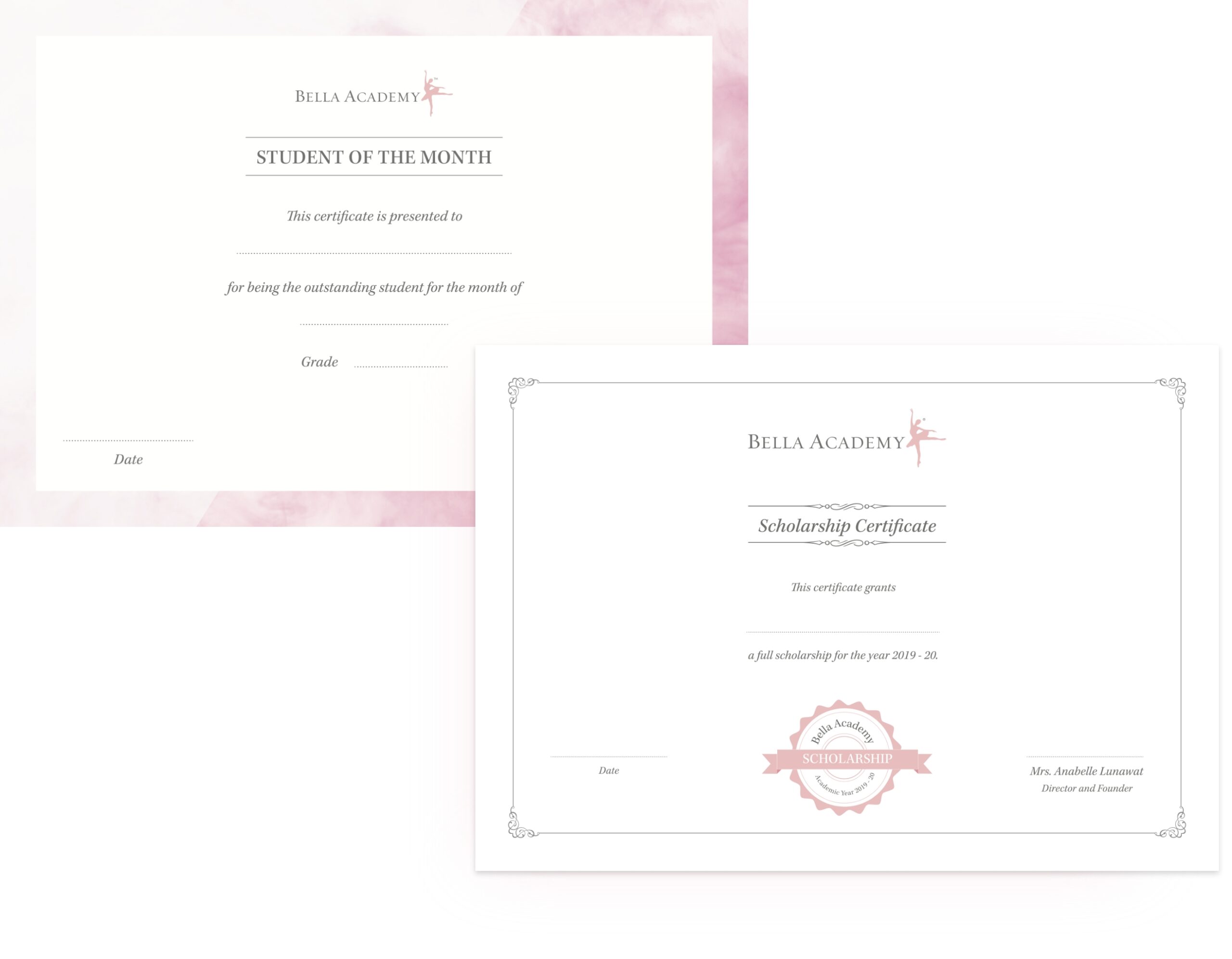
We translated the established brand language to everyday use items like corporate identity, emailers and certificates to environment graphics like standees and packaging items such as clothing tags and paper bags.

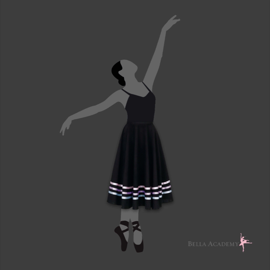
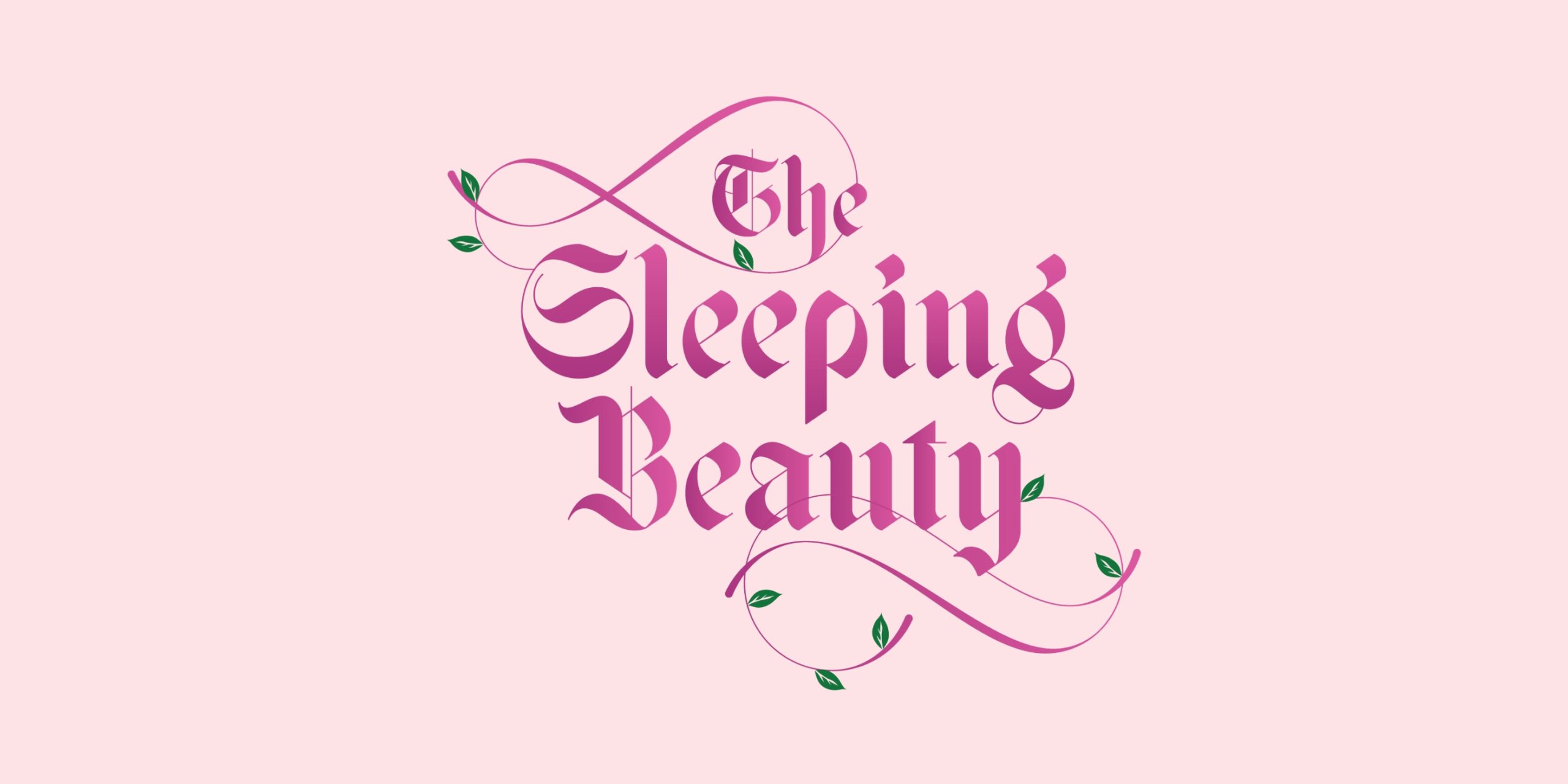
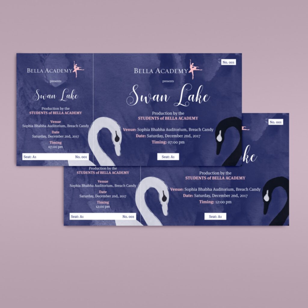
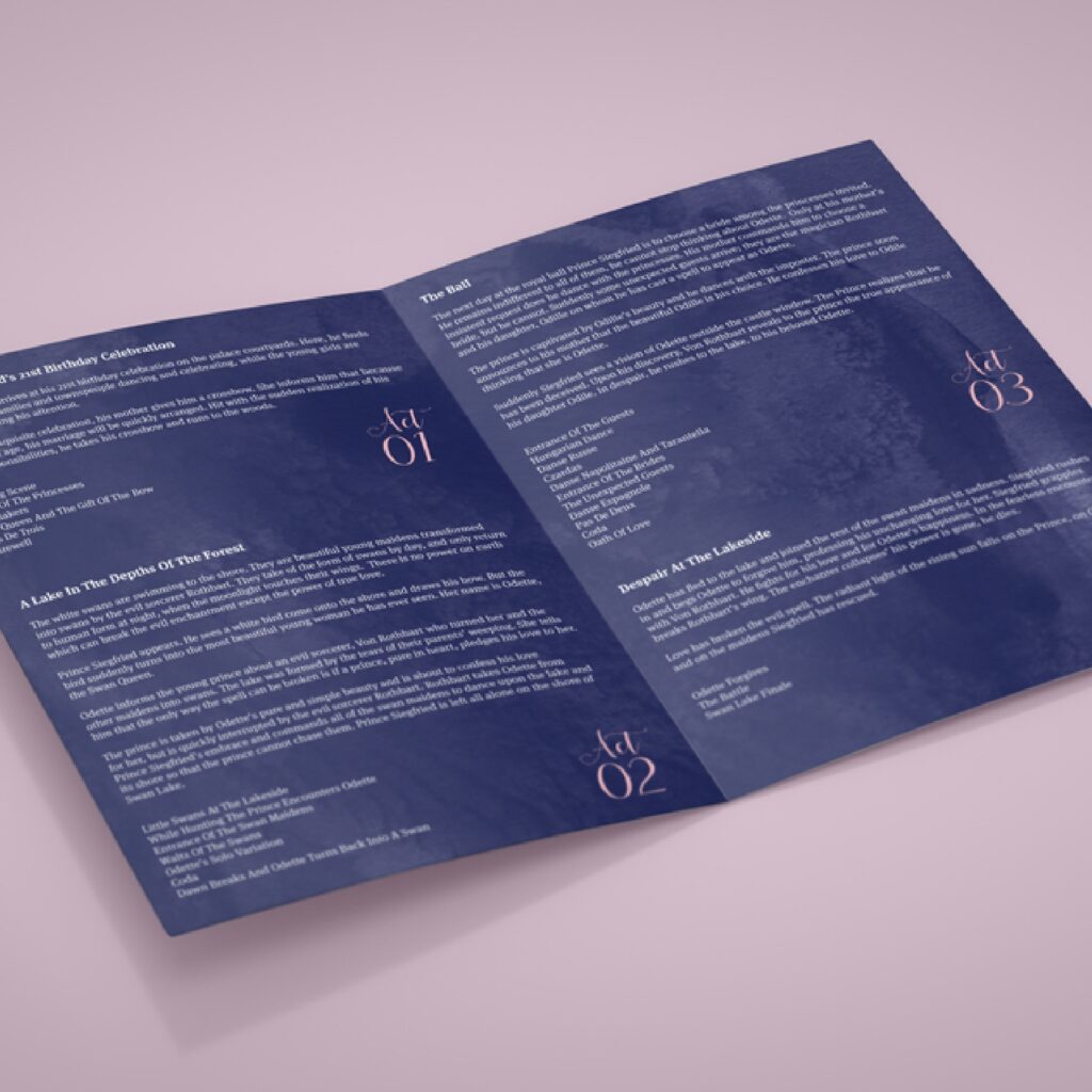
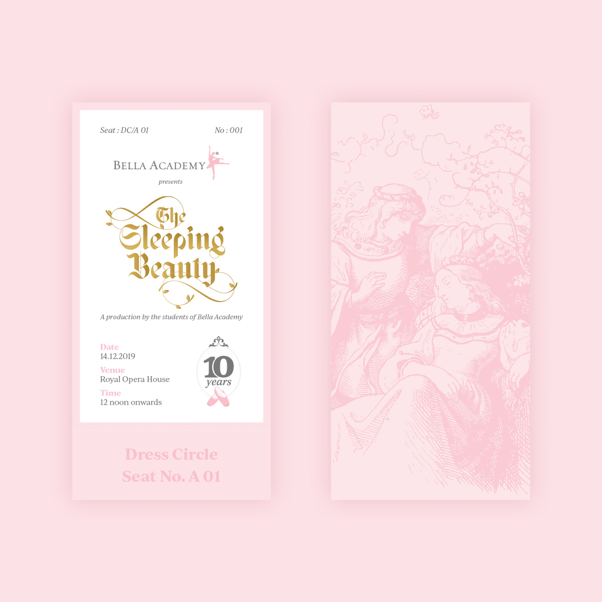
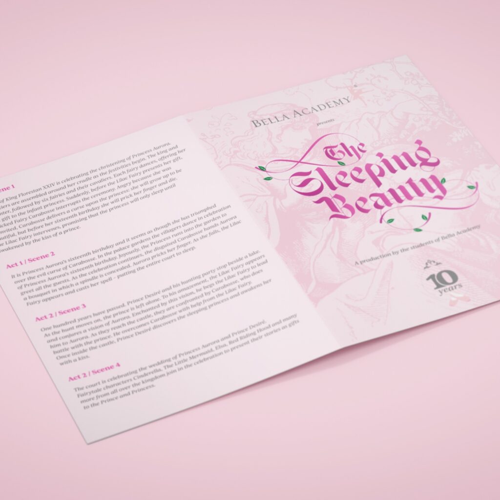
Bella Academy Productions
Once every two years, Bella Academy develops a production which is performed by its students.
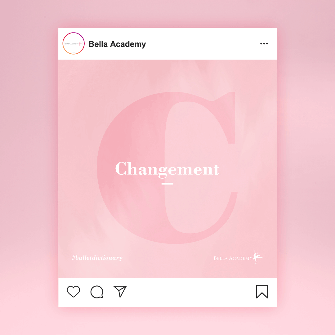
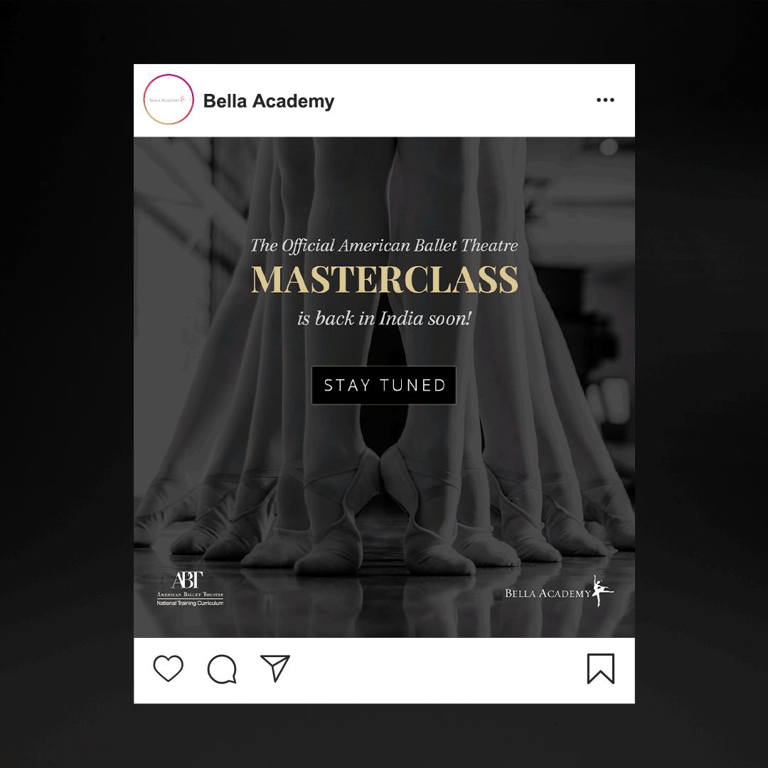
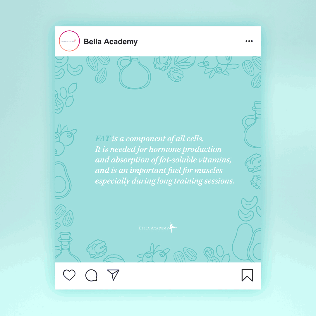
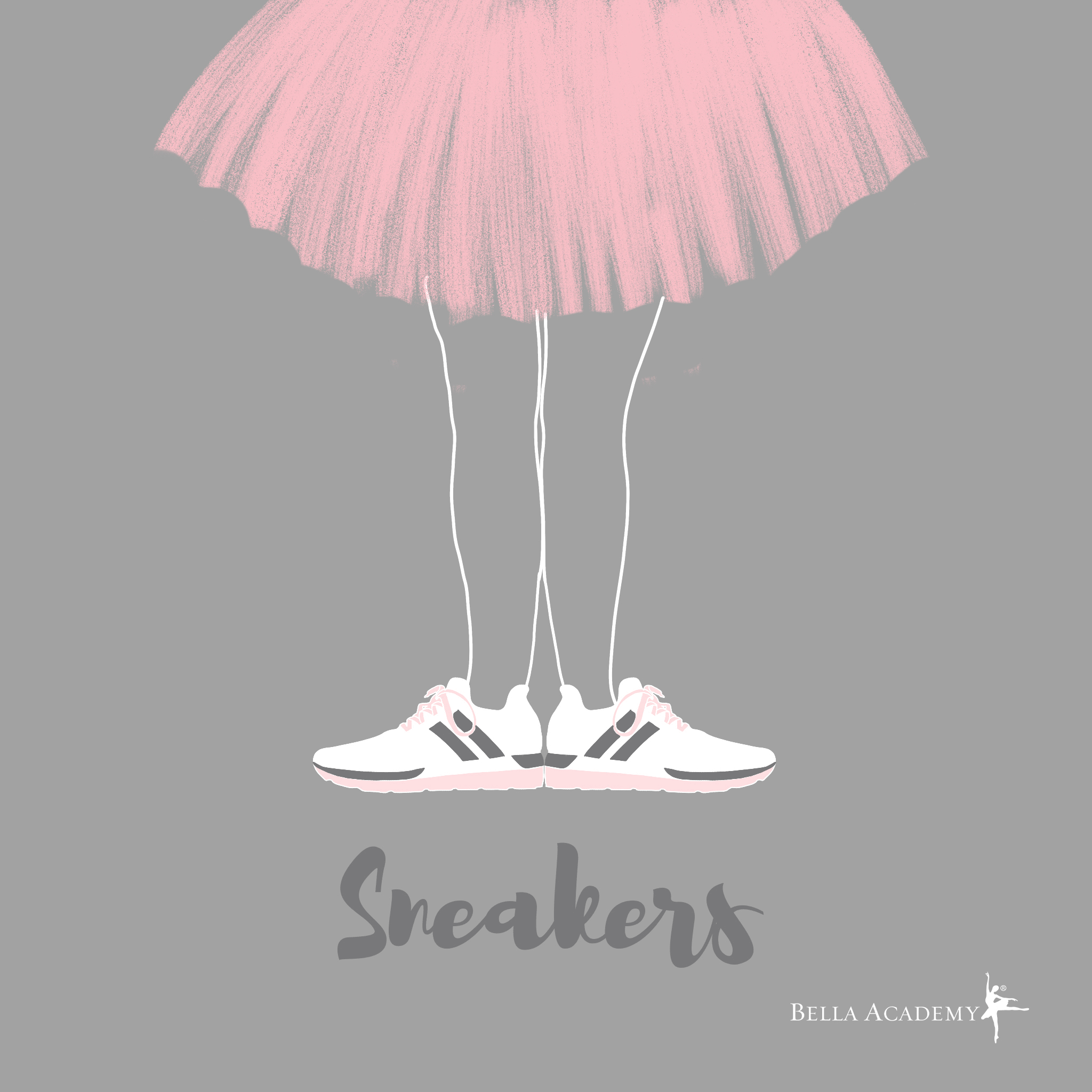
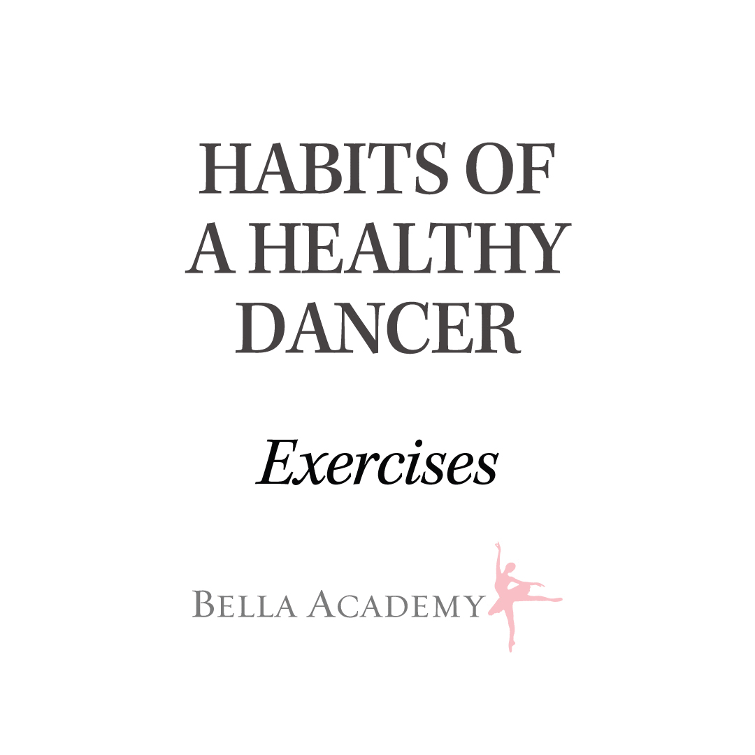
Social Media Creatives