OK Listen
Case Study
OK Listen! is the preferred global distribution partner for the biggest names in the indie music scene in India. It is a pro-musician digital platform that musicians can trust and a destination consumers can come to for discovering music and supporting the musicians they love.
The objective of the project was to update/refresh the brand’s existing identity, establish assets that can be used for online and offline marketing targeted mainly towards musicians. Design easy to use sign up and music release modules and a website where listeners can come to discover new and different music and musicians.
Brand Refresh
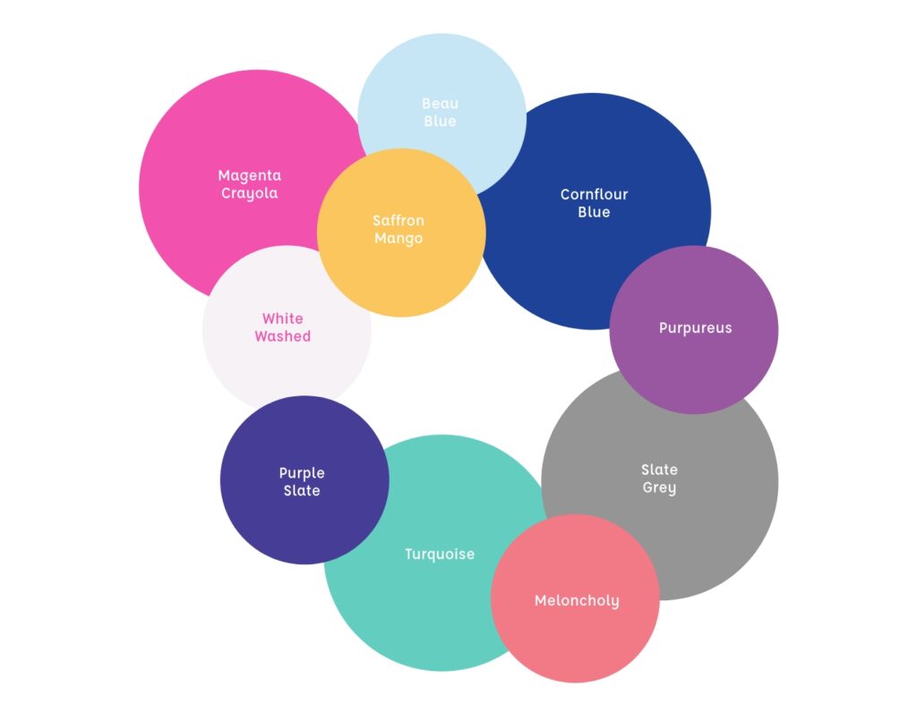
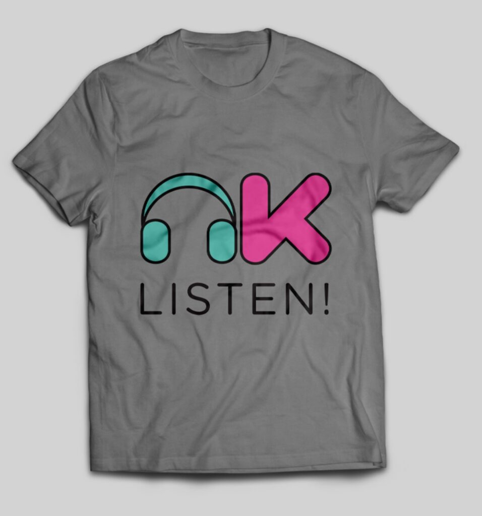
Primary and secondary colour palettes were introduced to create a boundless identity which reflected the wide range of music genres that OK Listen distributes.
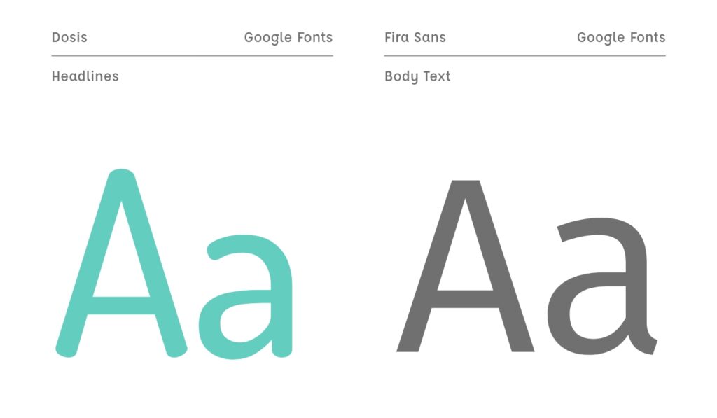
The typographic selection includes Dosis and Fira Sans. Dosis is a simple and minimalistic font with rounded edges while Fira Sans is a sturdy font and they represent the brands friendly yet stable personality.
The tone of voice is affable with hints of cheekiness which is illustrated mainly in the headline copy.
Marketing
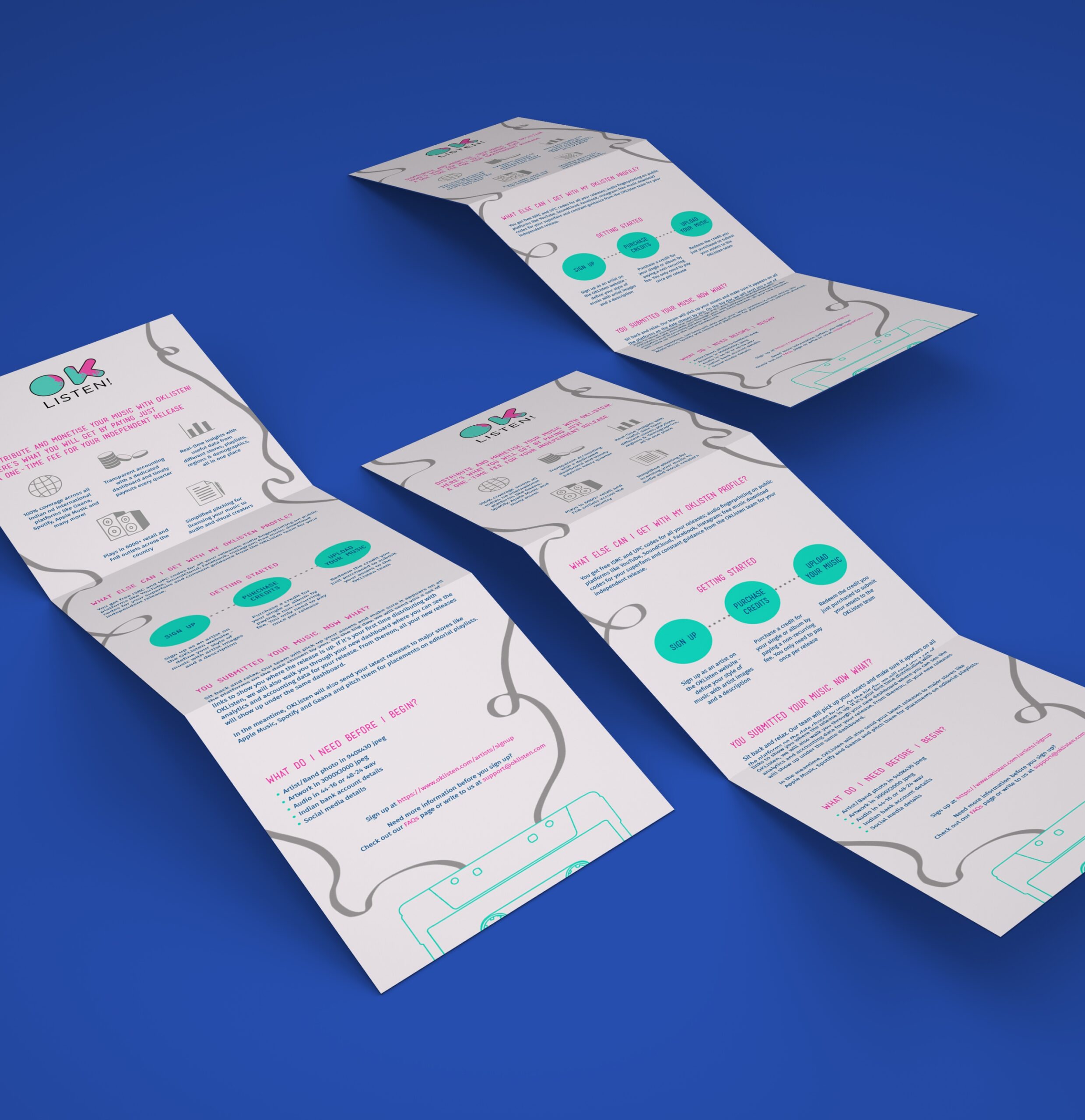
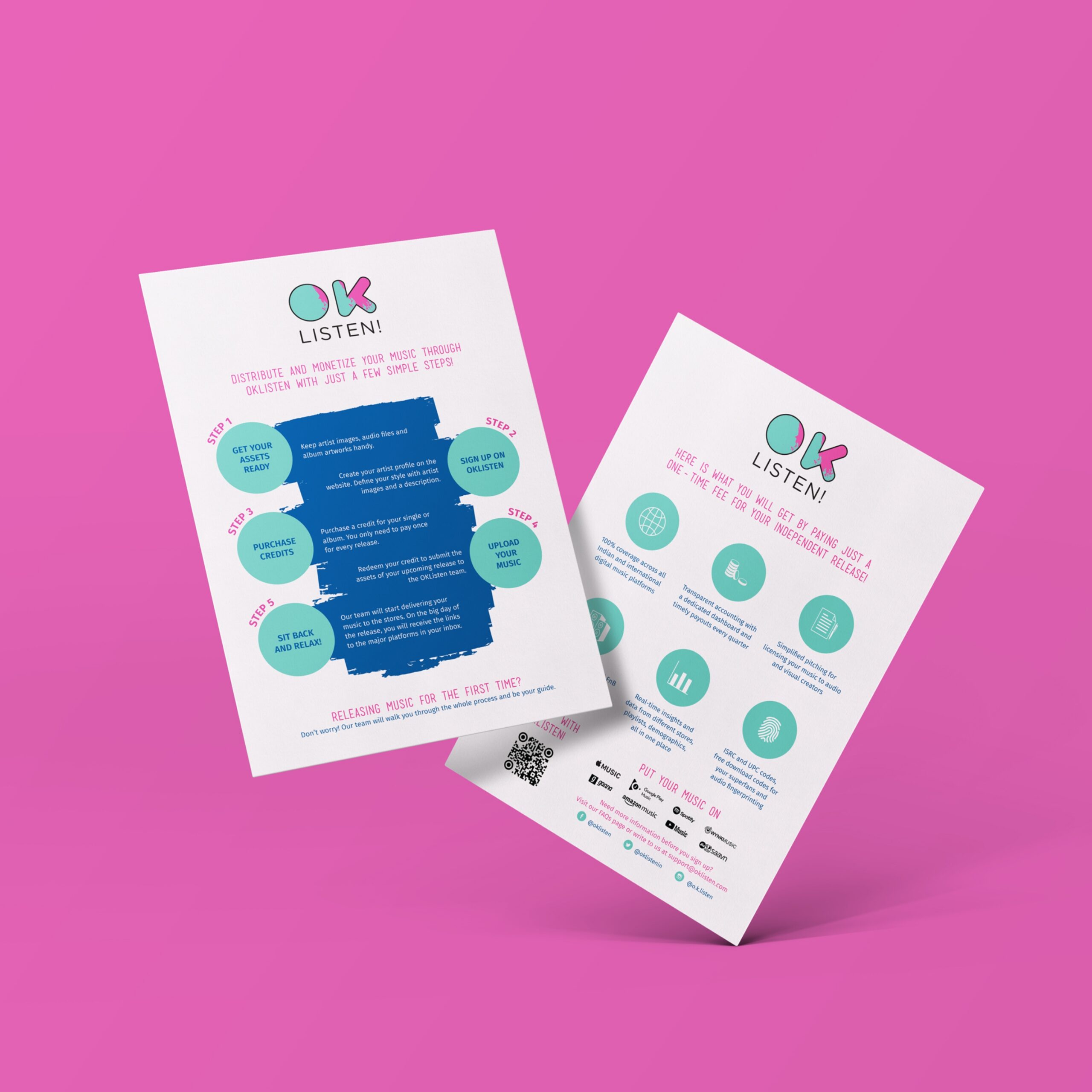
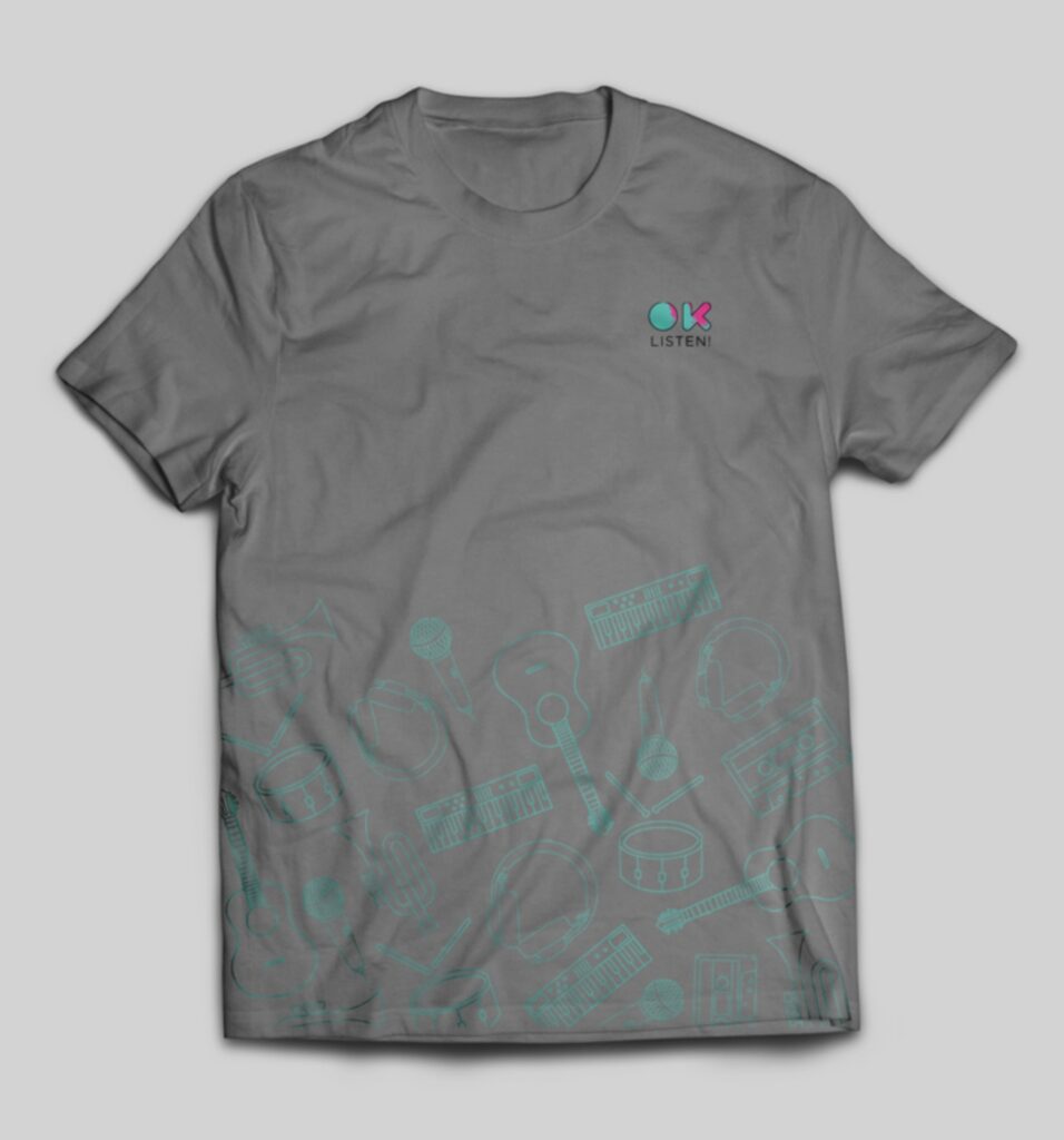
OK Listen! needed to demonstrate their effortless sign up process. We designed a simple infographic explaining step by step how easy it is for musicians to sign up on the OK Listen! website. The infographic design was also translated onto posters, flyers and standees for events. Along with these marketing assets we also designed social media posts and Tshirts for the brand to distribute at music festivals.

User Interface Design
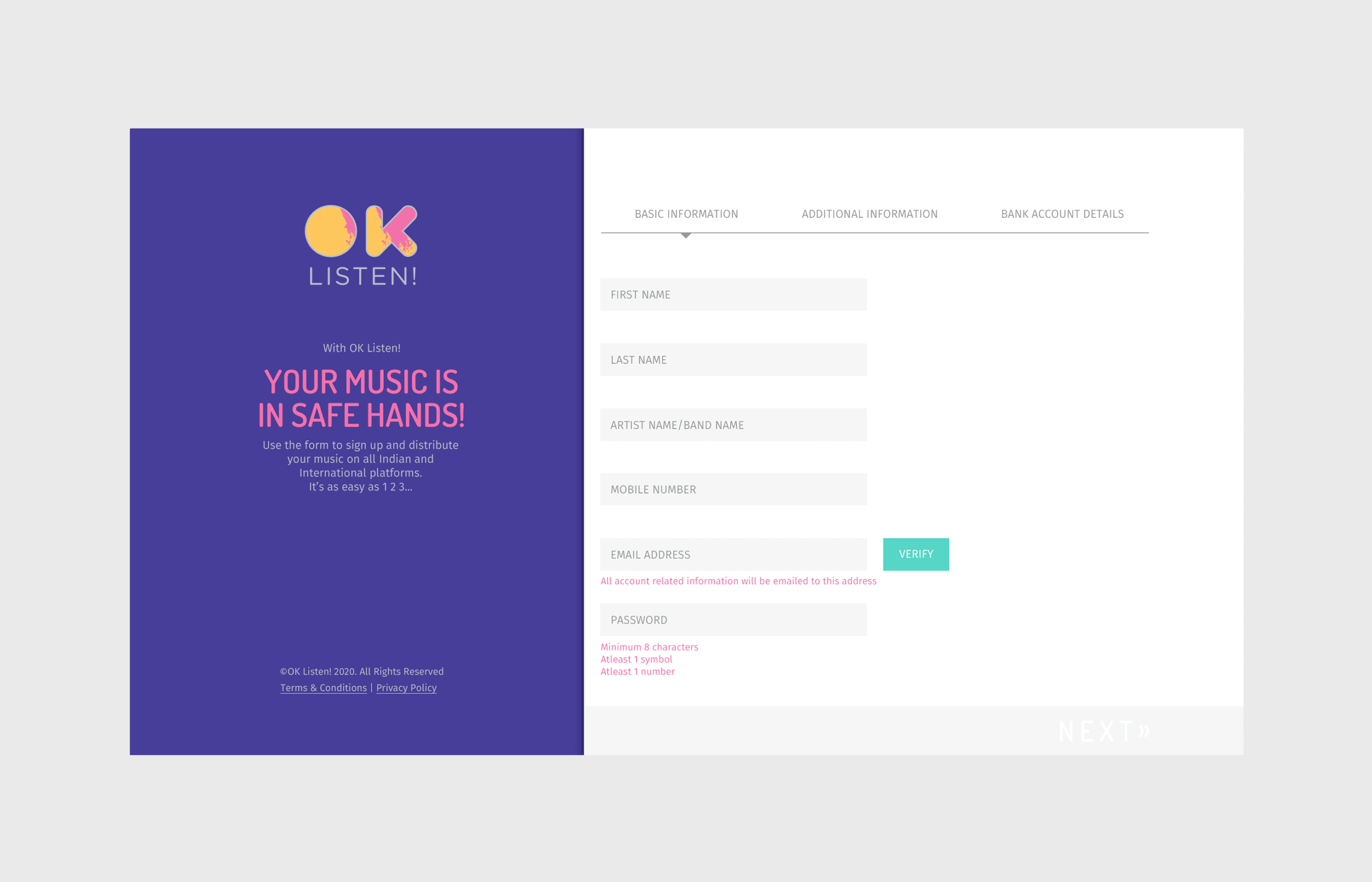
The sign-up module design is minimalistic and intuitive for the user in which one half of the screen comprises of the form fields that get highlighted as the information is filled in and the other half is updated and personalised with the artist’s information. The copy written especially for the OK Listen! platform is youthful and spirited in nature and enhances the intuitive experience for the interface.
The website needed to cater to both musicians and listeners, therefore it was crucial for the website to be instinctive and familiar. The home page showcases the new releases and features artists for the week. The other pages includes a Pricing Plans’ page which has information for artists on how to release their music, the FAQs page which helps with questions artists might have before they are ready to release their music, and the Discovery page is where the listeners may discover new and established artists and their releases. The bold colour palette and the overall design of the website are a reflection of the contemporary independent music scene in India, and OK Listen! The cheeky copy is written to further add to the intuitive and spirited quality of the brand that lends it a friendly and familiar vibe.